

Waze local
Testing and fixing up the Waze local site
Role
Vendor designer
Company
Waze
When
2019-2020
The challenge
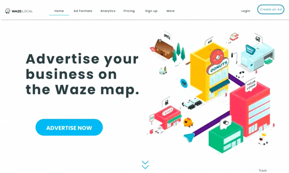
In 2019, Waze had decided to update their Waze local site. The CVR of the new site did not meet KPIs and required A/B testing between different versions. Me, together with the marketing team, suggested a new design which based its concept on actual marketing and UA data.

This is what we got from Waze:
Our take aways
-
No understanding who the target audience is.
-
Too much text, the customer gets lost.
-
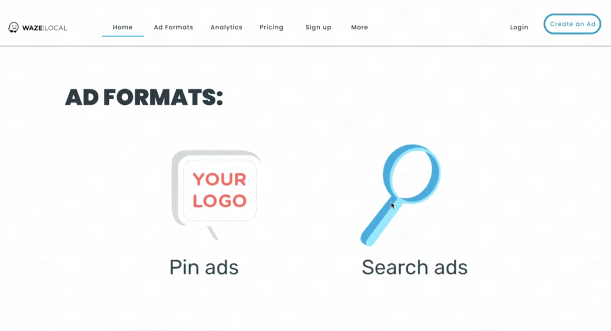
No understanding of the advertising options Waze is offering
-
Using red for CTA causes deterrence.


Our target audience are actual business owners with an actual store (not online stores).
Only 'on site' business owners can sign up to the advertising platform.
Presona
Site accuracy
Cutting down on text, leaving a short and straight forward CTA:
Changing the red to Waze blue
Letting the user know there is more.
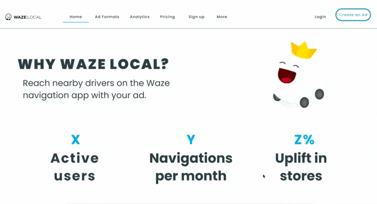
Include data so that users can quantify impact
Pop up example of the different ads.
The user should know and understand his options.
Minimize information while still leaving in the important points as a summary for the client.

To sum it up
By optimizing the site's layout, navigation, and call-to-action elements, we were able to increase user engagement and ultimately improve the KPIs and CTR. Our data-driven approach to the UX/UI design allowed us to deliver an effective solution that met our client's business goals.

Covid 19
Challenge
In 2019 covid hit the world and with it most businesses shut their doors. People went into lock down, therefor, no one used the waze map so owners stopped advertising.
Problem solving
letting businesses know they can advertise they are open for deliveries and pickups, giving small businesses a voice to call customers back to them.

Home delivery & pickup.


